


Case study·Pest control
A website rebrand, rebuild, and page reduction - all for a pest control firm starting out.
ClearFirst Pest Control Solutions, near Derby. They took on part of a business that already existed, and a website built for something a good deal bigger than what they were taking on. What they needed was one page that did the whole job.
He took on part of a business, and all of its website
ClearFirst Pest Control were already trading, but did not need the website. When one brother said to the other, do you want to trade under the same name and do specific services ... the website needed to reflect that. It was a big site - page after page, with a sizeable blog sitting behind them - and almost all of it had been written for the larger operation, that didn't need the web presence anymore.
It was a lot of website to inherit. Carrying the lot across wasn't an option, the budget was set and wouldn't accommodate a page for page redesign.
So, the answer was not a smaller version of the old site. It was one page: what he treats, who he treats it for, and how to get hold of him. Terms, cookies and privacy stayed as pages of their own, because they have to be. Everything else came down to a single page.
The logo they already had, made easier on the eye
There was a logo already and it was staying, so the job was to adapt it rather than make a new one. The plan was to end up with a version that could actually be used, because there was no high quality copy of the old one anywhere.

- Navy#08527F
- Green#81C437


One page that does the whole job
The previous site was on WordPress and we carried that through so that the client could use a platform that was already trusted. The bloated theme was gone though, made bespoke and optimised for speed.

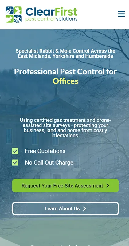
Everything a visitor needs is in one scroll: what he treats, how the work is carried out, the kinds of property and business he works for, what other customers have said, the questions everybody asks, and an enquiry form at the end of it.
The bar along the top looks like an ordinary menu and is not one. Every item on it moves you down this same page. Nobody waits for a second page to load to find out whether they are in the right place (the mobile menu works the same way!), and there is no route through the site that can go wrong, because there is only one route.
The form is the part that earns its keep. It asks which pests, what sort of property and whereabouts they are, so the first reply back can be an answer rather than a request for more information.
Shrinking a website is the easy half
Every one of those old pages had links pointing at it from somewhere - a search result, somebody's bookmarks, another company's page, a directory entry nobody remembers signing up to. Delete the page and the link goes nowhere. A visitor who has already decided to come and see you meets an error message instead, and that is the worst possible moment to lose somebody.
So the old addresses were mapped across before the switch rather than after it, each one pointed at the part of the new page it belonged to. The blog lived at /news/ and that address still takes you to the site today rather than to an error. It is unglamorous work, it is most of the work on a rebuild of this shape, and when it is done properly nobody ever sees it.
What this work does is make the difference between a change of build that a business absorbs and one it feels. Lost links can be lost revenue and we understand this fully.
Under the bonnet
The website, the web hosting, the email and the domain all sit with us, and maintenance keeps the site patched, backed up and online.
Hosting includes SSL, Timeline Backups of the site and its database, malware scanning and server maintenance, with edge caching through our CDN so a page is served from a node near whoever is reading it. A one-page site has nowhere to hide - there is no second page for somebody to land on while the first is having a bad day - so the things that keep it up matter more here than they would on a site with thirty.
The email is with us as well as the site, so an enquiry from that form does not cross between two suppliers on its way in. On a website whose whole job is collecting enquiries, that is not a small detail.
It is WordPress, so the page stays his - the words, the photographs, the questions in the FAQ. He can change any of it without a call to us. Most clients find asking us easier, and that is fine too.
A one-page website is a starting point, not a ceiling
This is what a simple one-pager looks like when it is done properly. It was built to be added to, and the business it belongs to has been growing since it went up.
Setting someone up for success in their new venture
 Gareth HallsworthClearFirst Pest Control SolutionsGoogle review
I can't recommend Andy and Bang! Graphics highly enough. He has helped me with several aspects of my business since start up, including designing my logo and letterhead, as well as creating and managing my website and web hosting.
What I particularly appreciate is how easy he is to deal with. Andy takes the time to understand what I'm looking for, is always happy to make changes or offer advice, and nothing ever feels like too much trouble. The finished work has always been professional and exactly what I was hoping for.
It's also great having someone I can rely on for everything from my branding and logo design through to my website and hosting, rather than having to deal with different people for each job.
If you're looking for someone friendly, reliable and genuinely good at what they do, I'd definitely recommend Andy.
Inherited a website bigger than your business?
One page done properly beats thirty nobody keeps true. Ask what yours would come down to, and what it would take to bring the old links with it.
 The call is with Andy, the person
who will primarily be working on your project.
The call is with Andy, the person
who will primarily be working on your project.


